I’m about to tell you about something that made my day last week. And I’m putting myself at risk for sounding like a complete and utter nerd… but it’s okay because I know some of you will really appreciate it.
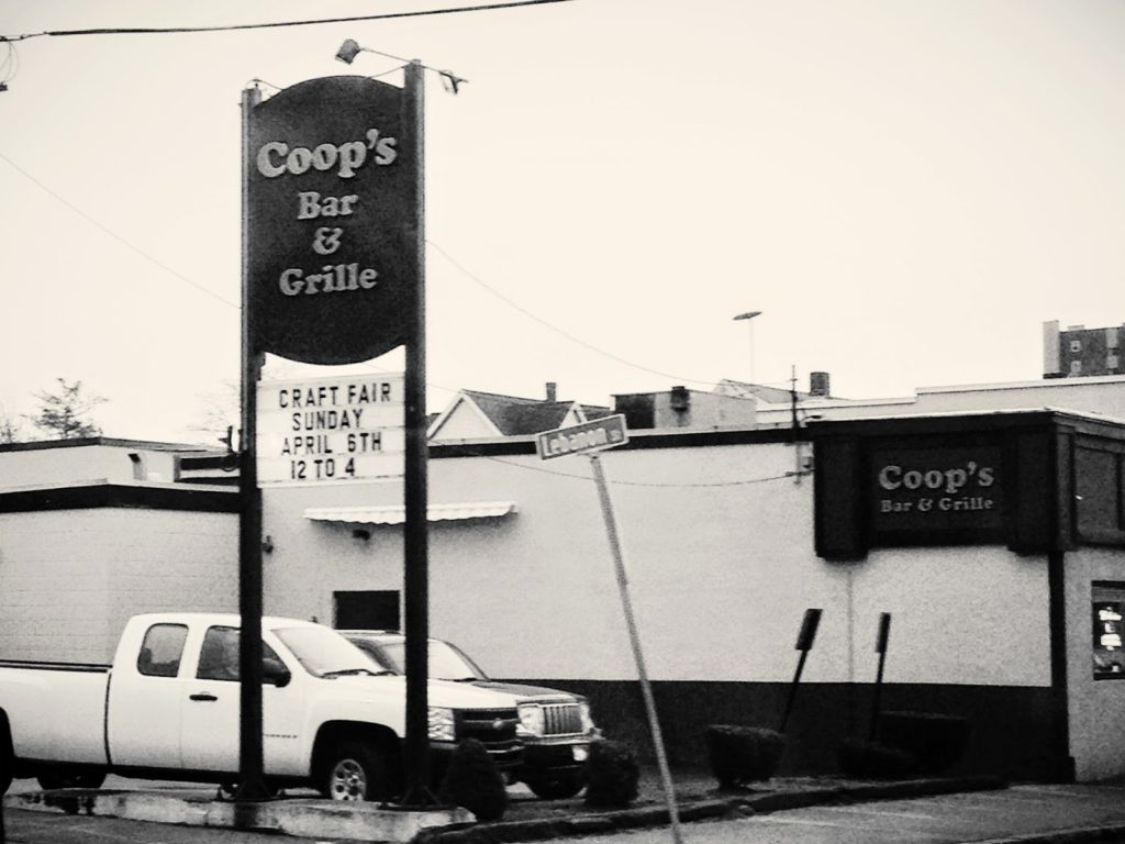
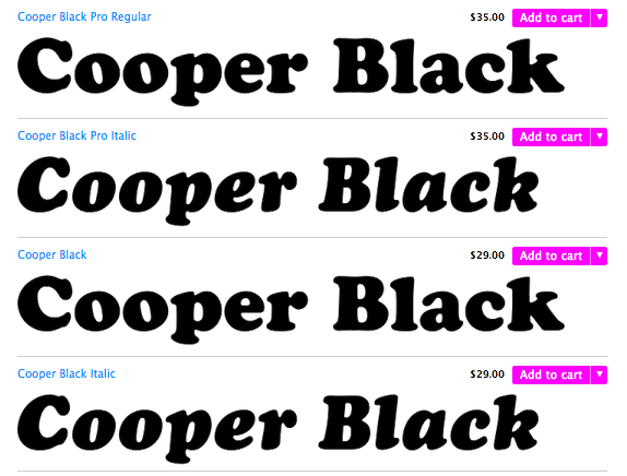
I was battling rush hour traffic on my way down to Hingham, Massachusetts for a photo shoot, when I drove by Coop’s Bar & Grille in Quincy. I was stopped at a red light, and that’s when I realized it – the font that was used for the sign was Cooper Black. This is what it looks like:
So three cheers for Coop’s Bar & Grille for using a font effectively… and in a clever way. I’m now dubbing this phenomenon a “font pun.”
xo,
Faith
{Design Fixation}


Comments are closed.