Posted in Miscellaneous
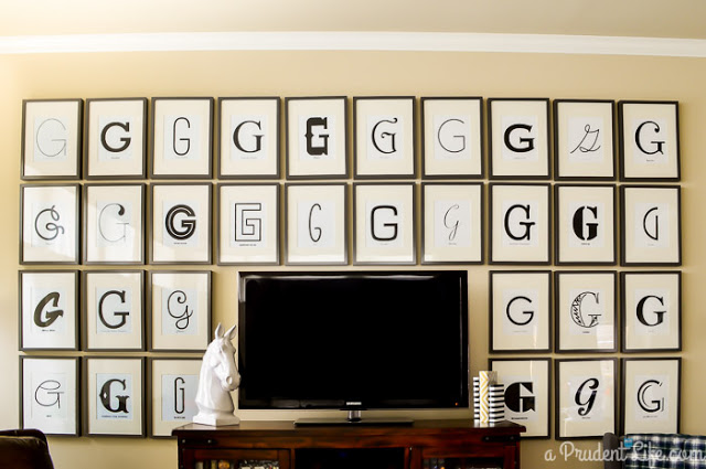
I can’t even express how fabulous this is. Wow. A monogram wall using all different typefaces. Just wow. Find out…
I can’t even express how fabulous this is. Wow. A monogram wall using all different typefaces. Just wow. Find out…
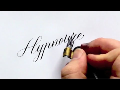
This is the coolest thing I’ve seen in a while. Mesmerizing. It is a video of master calligrapher Seb Lester’s…
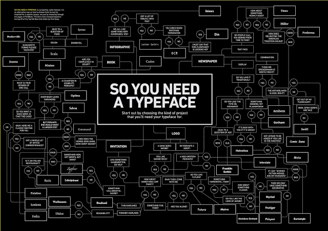
Stumped on what typeface to use for the project you’re working on? Here’s the answer… a flowchart called So You…
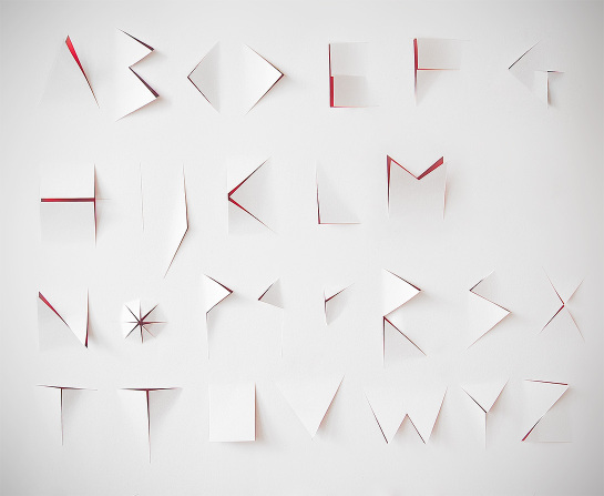
Designers Eurydyka Kata and Rafał Szczawiński call this beautiful typographical experiment the “Slasher Alphabet.” Letterforms are sliced out of one…
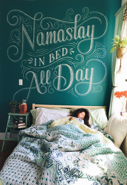
Love this! The lettering is oh so beautiful… plus it makes me giggle. By designer Lauren Hom. Head over here…
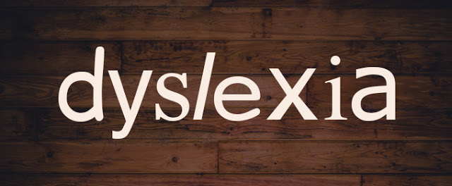
Here’s a fun font fact: people with dyslexia are better off reading text set in Helvetica rather than something like…
When I first saw this piece, I was amazed. So I was thrilled to see this little video about how…
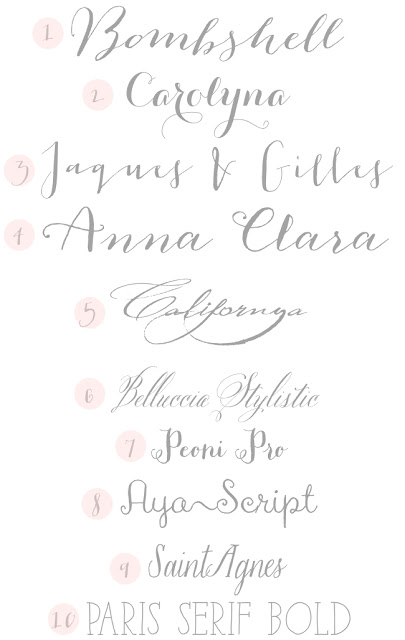
1. Bombshell Pro 2. Carolyna Pro 3. Jaques & Gilles 4. Anna Clara 5. Californya 6. Bellucia Stylistic 7. Peoni Pro 8. Aya Script 9. Saint Agnes 10. Paris Sherif Since wedding season is in full swing, I’ve…
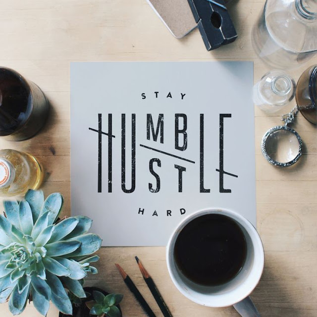
Nice typography… nice message too. Found via From Up North.
Surprise surprise, more food-related typography for this week’s installment of Typeface Tuesday! I’m noticing a trend here. Can you imagine…
Sources: 1 /// 2 /// 3 I love it when I run across an ampersand in the wild… above are…
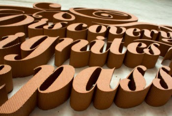
Some stunning 3-dimensional cardboard type for you on this Typeface Tuesday. Now this is art. See more images over here.
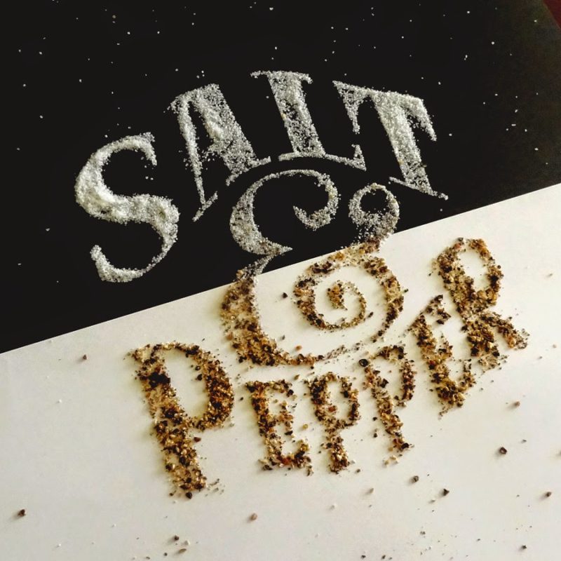
Can you imagine life without salt and pepper? I put it on pretty much everything I eat. And I also…
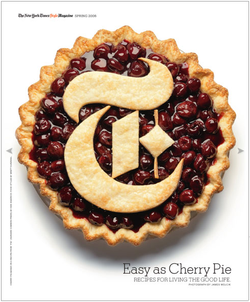
I’ve posted about the cover of the New York Times Style Magazine before, but I had never seen this cherry…