All images by me.
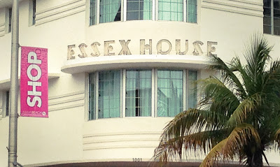
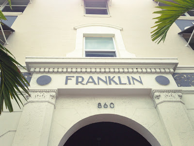
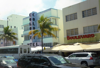
I recently took a trip to Miami. I was interested in checking out all of the Art Deco hotels along South Beach, but I ended up being most fascinated in the typography of the signs. So many appeared to be original… they brought me back to another era. I especially love the stout yet angular lines of the Essex House sign above. Want to see more? Here are lots more examples of Art Deco typography in Miami.
xo,
Faith
{Design Fixation}


