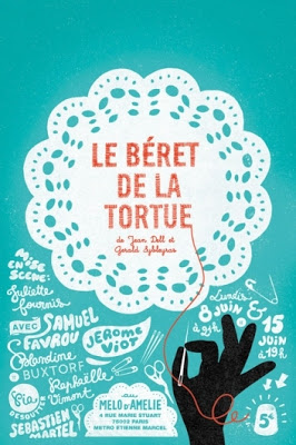
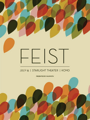
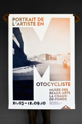
Sometimes I like to show that although a piece of design isn’t outwardly focused on typography, but when you look a little closer it becomes clear that the layout relies heavily on it. All three posters above fit this description to varying degrees. Imagine each one with just a plain old, boring font treatment and it becomes obvious that the typography is the star here.
xo,
Faith
{Design Fixation}


