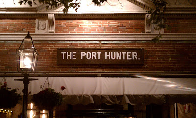
Sometimes I run across beautiful typography in everyday life, and this was one of those times. The Port Hunter restaurant in Edgartown, MA was named after a nearby shipwreck; the owners did a wonderful job of capturing that nautical sense in the font that they used for the sign. I especially enjoy that they used a period after the name, as if it is the restaurant to go to. I could say quite a bit about the typeface, but my friend E described it very concisely… “it’s like an old man, very high waisted.”
Image by me.
xo,
Faith
{Design Fixation}

