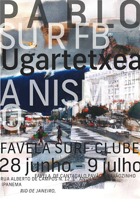
Sometimes it’s not the typeface itself, it’s the way you treat the type that is the real genius. I’m sure David Carson would tell you that. Above is one of his newer pieces, but it adheres to the same style that Carson has always been famous for. Ignoring traditional graphic design layout rules, he puts words up against the edge of the page and even right next to each other.
Traditional, no. Beautiful, yes.
xo,
Faith
{Design Fixation}

