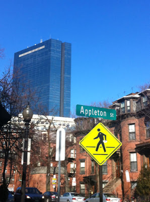
Here is an interesting real life typography situation in which someone has written to the mayor about the proportion of the A in relation to the rest of the letters on a street sign. And while it may seem like a small detail, it is indeed true – the A is much larger than the letters that follow. Click on the link above to see what this observant citizen had to say about the sign.
I love it when people know things about typography. Thanks to my good friend C for sharing that link.
xo,
Faith
{Design Fixation}

