I tend to avoid white walls after dealing with “renter’s white” for so many years. But these images have begun to convince me that, if executed properly, white can be luxurious and inspiring. But I believe that a focal point of some sort is a crucial element of a neutral room. Take a look at these examples:
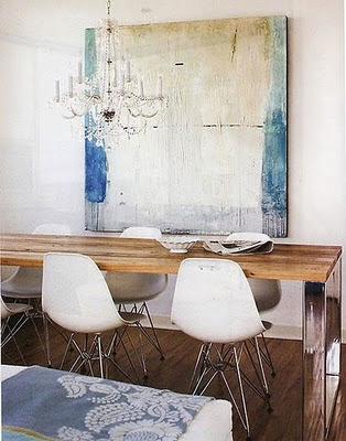
The light color scheme in the room allows you
to focus your attention on this beautiful
painting. Found at Automatism.
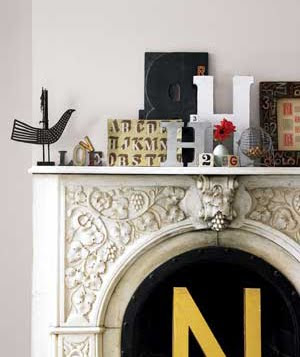
It’s no surprise that I love this typographically
abundant mantel. Found at Real Simple.
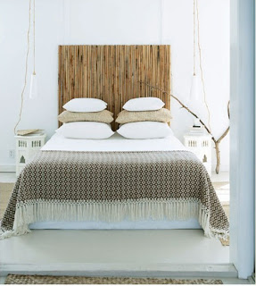
A bamboo headboard lends a natural feel. Via Style Files.
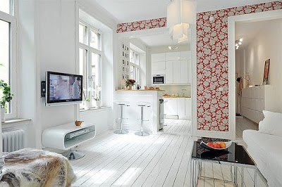
Bright wallpaper adds a focal point to a
mostly white room. Found at Decor8.
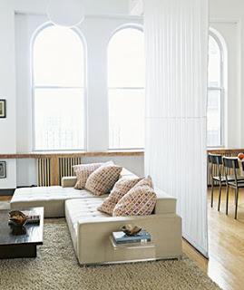
Colorful pillows add interest to
this neutral room. Found here.
My steel blue kitchen might be getting a neutral makeover soon…. Also, I wanted to say thanks to Forbes.com for featuring Design Fixation in it’s new Future By Design project! Click here to read the article, where I delve into deep subjects such as technology’s effects on blogging and artistic knockoffs.
Don’t forget to stop by tomorrow for some inspiration of the paper variety. These images will knock your socks off, I guarantee it.


Comments are closed.