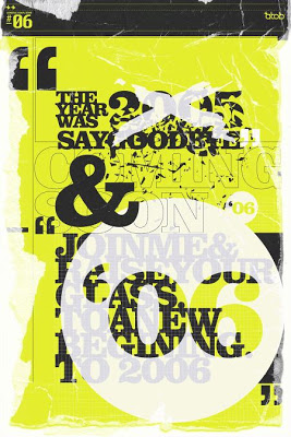
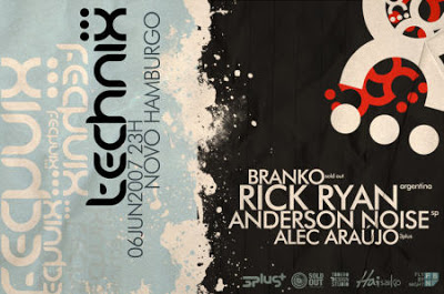
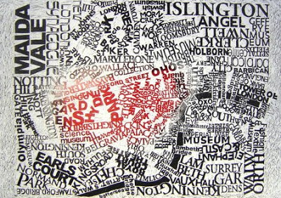
Take a look at this typography eye candy. Visit Smashing Magazine for more.
Which do you like the best? I’m partial to the second one…. although I wish the side that the horizontal text is on took up two thirds of the poster instead of just over half. Rule of thirds maybe?


Comments are closed.