See Navya’s beautiful Scituate, Massachusetts fixer upper here. Tour Bethany and John’s eclectic Essex, Massachusetts home here. Michele’s lovely Eliot,…
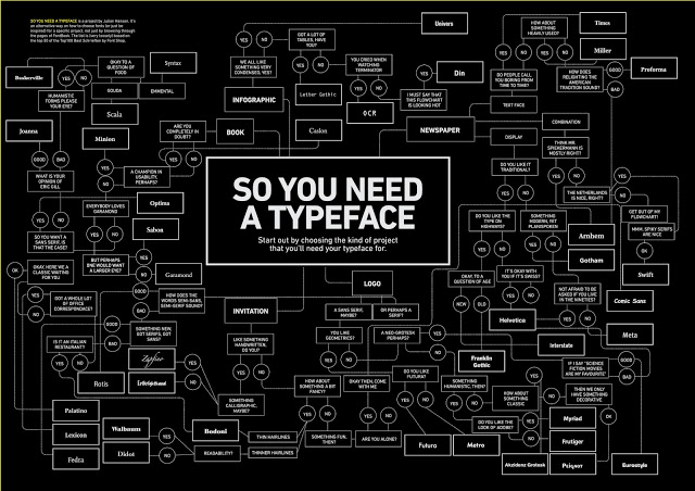
Stumped on what typeface to use for the project you’re working on? Here’s the answer… a flowchart called So You…
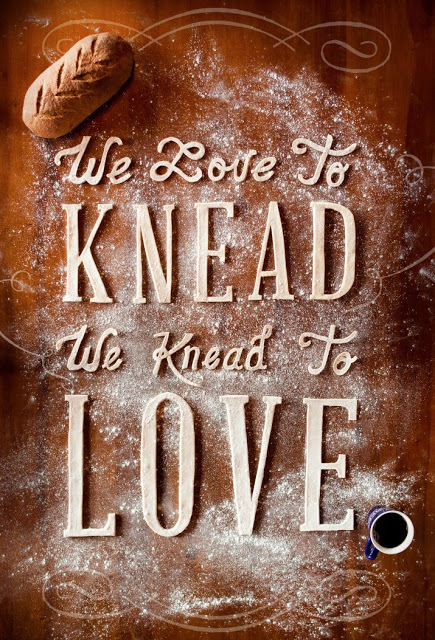
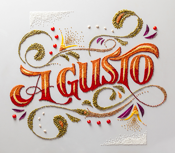
Another food-related typography piece for you on this lovely Tuesday. This gorgeous piece was created by the very talented Michael…
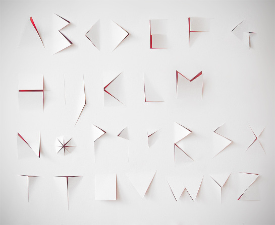
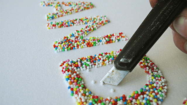
Designers Eurydyka Kata and Rafał Szczawiński call this beautiful typographical experiment the “Slasher Alphabet.” Letterforms are sliced out of one…
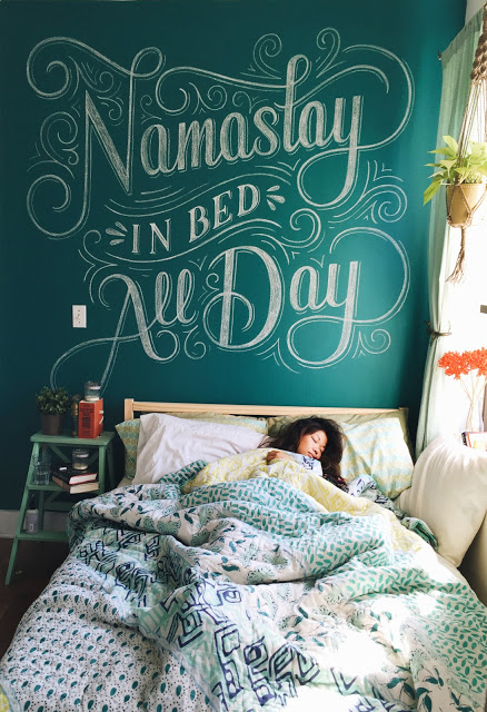
Love this! The lettering is oh so beautiful… plus it makes me giggle. By designer Lauren Hom. Head over here…
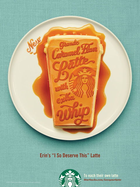
I’ve always been a fan of designer Jessica Hische’s work, so when I heard that she did an ad campaign…
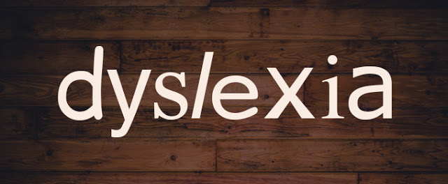
Here’s a fun font fact: people with dyslexia are better off reading text set in Helvetica rather than something like…
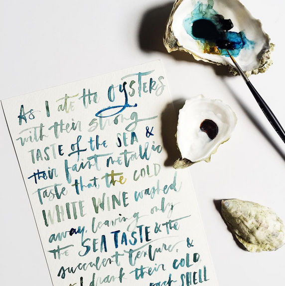
There isn’t much I don’t like about this Instagram photo… the quote (Hemingway), the colors, the oyster shells, and of…
Sources: 1 /// 2 /// 3 /// 4 /// 5 As a designer, I’m constantly questioning my business cards because…
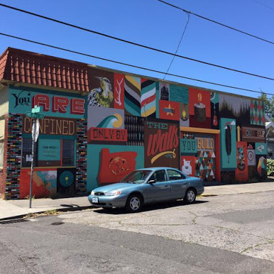
Loving this #FontSunday submission by @cecile_cuddihy on Twitter. Street art and typography all in one… my dream come true! Check…
When I first saw this piece, I was amazed. So I was thrilled to see this little video about how…
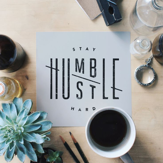
Nice typography… nice message too. Found via From Up North.
Surprise surprise, more food-related typography for this week’s installment of Typeface Tuesday! I’m noticing a trend here. Can you imagine…
By now you may have noticed that I have a bit of an obsession with typography made using edible items.…

